
Tile · Color and design
Timeless Tile Design Ideas: Format, Finish, Pattern, and Grout
A tile installation can remain in place far longer than a paint color or decorative accessory. The most durable-looking rooms usually have a clear hierarchy: one lead surface, supporting materials, purposeful grout, and details sized to the actual space.
The short answer
For a tile design that ages well, choose the room's main visual idea first—quiet stone, warm wood, clean geometry, handmade character, or a deliberate pattern—then keep the supporting choices restrained. Match tile size and layout to the room's sightlines, use finish for the actual application, choose grout based on both contrast and maintenance, and plan cuts and edges before ordering. Timeless does not mean plain; it means the materials and details make sense together after the novelty fades.
What matters most
- Choose one visual lead and let most other tile, grout, paint, and hardware choices support it.
- Large tile, small mosaics, rectangles, squares, and shapes each change the rhythm of joints and cuts; none is universally more timeless.
- Grout can blend with tile, outline it, or become part of the pattern, but real samples reveal contrast more reliably than a screen.
- A visually successful tile still needs the correct floor, wall, wet-area, cleaning, and installation approvals.
Start with one sentence
Name the room's main idea before selecting pieces
Try to describe the finished room in one sentence: a calm light-stone kitchen, a warm spa-like shower, a graphic black-and-white powder room, or an entry with quiet concrete character. That sentence becomes a filter. A beautiful tile that fights the main idea can stay out of the project even if it looked compelling on its own.
Next, identify what already has strong visual movement. Granite, quartzite, veined counters, figured wood cabinets, bold wallpaper, and patterned textiles can compete with an equally active tile. If the room already has a lead surface, a quieter field tile and lower-contrast grout often provide balance. If the permanent finishes are quiet, a patterned floor, shaped backsplash, or shower niche can become the focal point.
A focal point needs quiet around it
Pattern feels intentional when the eye knows where to rest. Repeat one color, finish, or shape elsewhere rather than introducing a second unrelated statement.
Use format to control visual rhythm
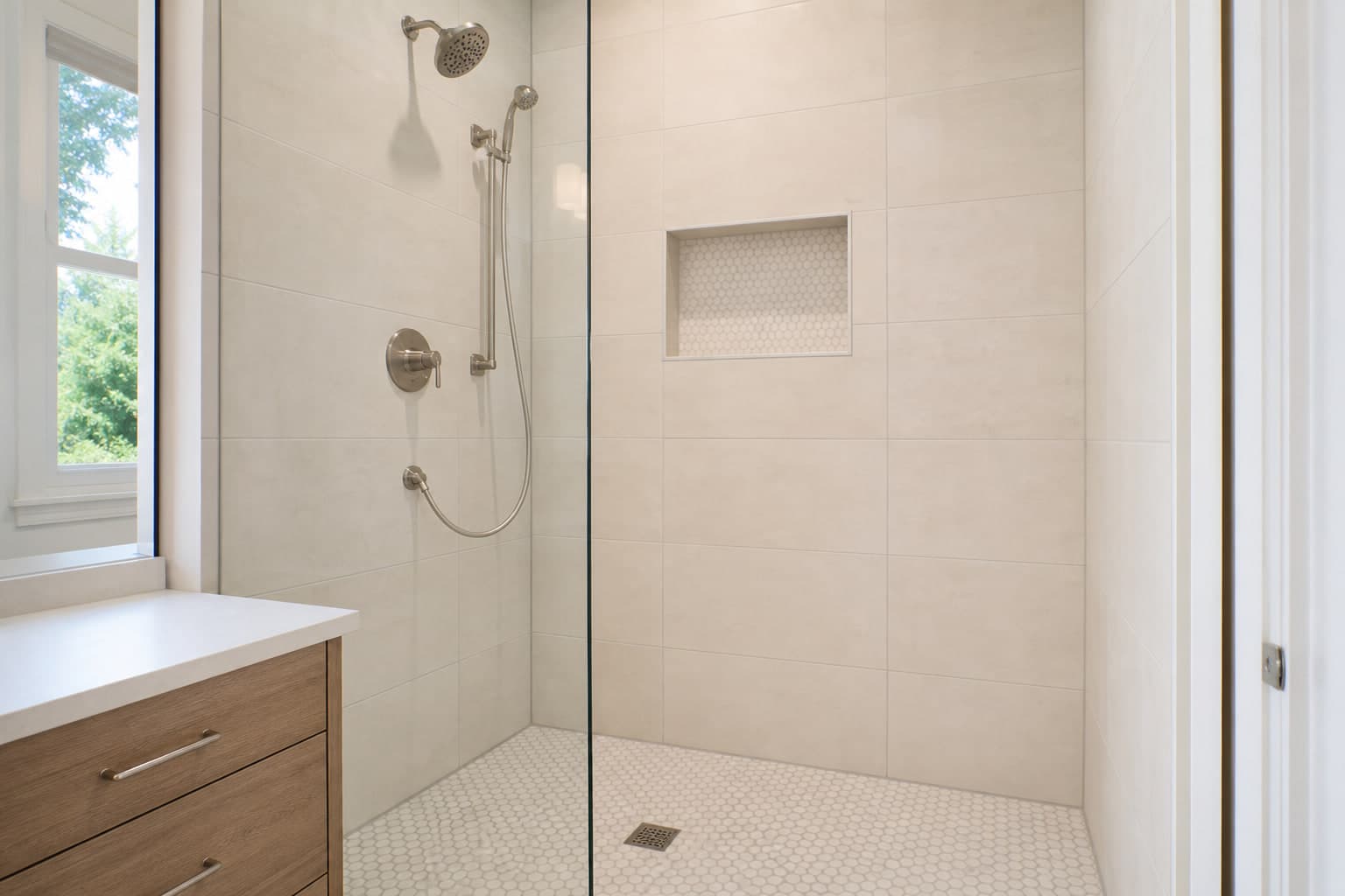
Tile format means the piece's size and shape. Larger rectangles create fewer joints across a field, while small mosaics create a finer grid and can follow curves or shower-floor slopes. Long planks emphasize direction. Squares feel orderly. Hexagons, pickets, and other shapes add geometry even when their color is quiet. The right scale is the one that produces sensible cuts and proportions in the actual room.
Do not select size only to make a room appear larger. A broad tile may simplify the field but create thin pieces at walls, awkward cuts around cabinets, or added preparation demands. A small tile may add more grout yet align naturally with a compact floor or curved boundary. A measured layout—full room dimensions, visible centerlines, fixed objects, and transitions—shows the tradeoff before material is ordered.
| Choice | Visual effect | Planning question |
|---|---|---|
| Large rectangles or squares | A broader field with fewer visible joints | Will the room allow balanced cuts, and is the surface flat enough for the selected tile? |
| Small mosaic | Detailed rhythm and more visible grout | Are sheet joints, slope, cleaning, and exact floor or wet-area approval resolved? |
| Plank format | Strong direction and a wood-like or linear read | What offset, pattern repeat, tile shape, and surface preparation does the maker call for? |
| Decorative shape or print | An immediate focal point | Where should the pattern center, stop, and meet quieter material? |
Let finish respond to light and use
Polished tile can reflect daylight and fixtures, strengthening contrast and color. Matte tile spreads light more softly. Texture creates shadow and can make a one-color surface feel layered. These effects change across the day, so stand samples vertically for a wall and horizontally for a floor, then view them in both daylight and the room's planned electric light.
Application still comes first. A glossy wall surface may be simple to wipe but too reflective for the desired mood. A deep texture may look convincing as stone but collect cooking residue on a backsplash. A finish chosen for a bathroom floor needs exact product-use and traction information; a finish chosen inside a shower also belongs within a complete water-managed assembly.
Decide whether grout should disappear or draw
Grout close to the tile color tends to connect the pieces into a calmer field. Contrasting grout outlines every piece, making the size, shape, and laying pattern more visible. Neither choice is automatically easier to maintain. Very light grout may show tracked soil or cooking spills; very dark grout can show pale residue, mineral deposits, or uneven cleanup.
Choose from physical grout samples next to several tiles because wet grout, dry grout, lighting, tile texture, and joint width change the result. Also distinguish grout from movement joints: movement joints are flexible details placed where the system must handle normal building movement. They should not be filled rigidly just to preserve a continuous color line.
For a quiet field
Use a close grout color and let texture, shade movement, or finish provide depth.
For a visible pattern
Use measured contrast, knowing that every alignment, joint width, and cut will become easier to see.
For practical upkeep
Compare likely soil and cleaning residue with the actual grout color and follow its sealing and cleaning instructions.
The lasting impression often comes from the edges
A tile field can be beautifully chosen and still feel unfinished when exposed edges, outside corners, niches, doorways, baseboards, and neighboring floors are resolved late. Decide whether those details use a matching finished-edge tile, a metal profile, a wood trim, a stone piece, or another approved treatment. Confirm availability before the field tile is ordered.
Transitions also affect accessibility and cleaning. Tile, mortar, underlayment, heating layers, and preparation combine into a finished height. Compare that height with hardwood, carpet, Luxury Vinyl, thresholds, doors, and appliances early. A deliberate boundary usually ages better than an improvised strip added after installation.
Edit the scheme before you commit
Lay out the main tile, accent tile, grout, trim, countertop, cabinet finish, paint, and hardware together under room-like light. Remove one item at a time. If the room's concept becomes clearer when an accent disappears, the design probably does not need it. Photograph the approved combination and label every exact product and color.
Then complete the performance review: location approval, slip considerations, variation range, finish care, grout, water management where needed, prepared-surface requirements, layout, edge pieces, movement accommodation, ordered waste, and spare material. Design and construction are not separate approvals; the strongest result satisfies both.
Plain-language answers
Common questions
What tile colors are most timeless?
There is no guaranteed timeless color. Warm whites, grays, earth tones, and material-inspired colors can be adaptable, but a coherent relationship with the room's fixed finishes matters more than following a neutral list.
Should floor and wall tile match?
They can, but they do not have to. Repeating one color or material family can create continuity while format, finish, or scale changes to suit each application. Every tile still needs approval for its own location.
Does matching grout make a room look bigger?
It can make joints less prominent and the tile read as a more continuous field, but room proportions, lighting, layout, and contrast elsewhere also shape perceived size.
Can I use a decorative wall tile on the floor?
Only if that exact tile is rated for the intended floor use. Appearance and thickness do not prove that its face, edges, or body can handle foot traffic.
Checked, not guessed
Sources and technical review
Reviewed on September 11, 2026 by Floors Now! flooring team, Connecticut flooring sales and installation team. The sources below support the general guidance. The instructions, room approvals, cleaner list, installation guide, and warranty for the exact product you buy always take priority.
- Tile Council of North America: Ceramic tile frequently asked questions
Industry guidance on tile selection, grout joints, layout, mortar coverage, surface flatness, movement joints, and other installation fundamentals.
- Tile Council of North America: Dynamic coefficient of friction frequently asked questions
Explains tile-use classifications, how wet-test results are used, and why one laboratory number cannot predict whether a person will slip in every real condition.
- Daltile: Ceramic and porcelain tile care and maintenance
Manufacturer instructions showing that cleaner and sealer choices depend on the tile surface, grout, finish, and exact care document.
- MAPEI: Tile leveling and lippage systems
Technical explanation of preparation, large-format tile flatness requirements, lippage, and the limits of clip-and-wedge systems.
Keep planning
Tile buyer's guide
Compare tile material, visual direction, room fit, finish, layout, care, and installation requirements.
articleMix tile patterns without visual overload
Use focal points, scale, grout, centering, and restraint to coordinate more than one tile.
productBrowse tile products
Save format, color, and finish ideas, then verify exact application and installation details.
projectSee a finished porcelain entry
Review a documented Connecticut installation using a quiet gray 12-by-24-inch tile.