
Luxury Vinyl · Color and design
How to Choose a Realistic Luxury Vinyl Look: Pattern Repeat, Color, Texture, and Scale
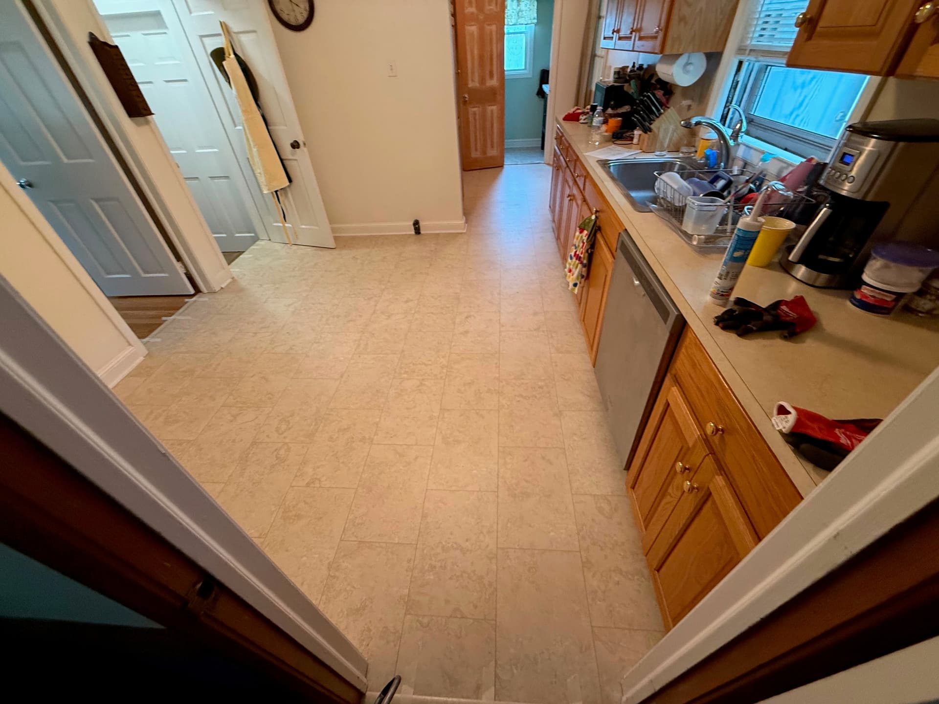
A convincing Luxury Vinyl floor is not just a nice photograph on one sample. Realism comes from how many visuals appear across the room, how texture and edges support them, and whether the size, color, and layout make sense beside everything else.
The short answer
Judge Luxury Vinyl from several full planks or tiles laid together, not one small chip. Look for varied printed images, believable color movement, texture that agrees with the wood grain or stone veining, restrained shine, appropriate edges, and a format that fits the room. Then view the sample flat on the floor in morning and evening light.
What matters most
- LVP means plank shape and LVT means tile shape; either can use many looks, constructions, and installation methods.
- More unique printed faces and thoughtful mixing can make obvious repeated knots or stone marks less noticeable.
- Color undertone matters more than whether a sample is simply labeled beige, gray, brown, or natural.
- Layout, border choices, grout-look details, and plank or tile size must be allowed for the exact product.
Start with the whole field
A floor is a repeated field, not a single sample
Luxury Vinyl uses a printed design to create the wood, stone, concrete, marble, or decorative image. The product may include multiple printed faces, rotations, or plank and tile sizes. When a memorable knot, dark streak, or vein repeats too closely, the eye notices the manufacturing pattern instead of the intended material.
Ask how many unique visuals the collection includes and whether cartons are intentionally mixed during installation. Open several cartons when permitted, separate distinctive pieces, and plan their spacing before adhesive or locking makes the arrangement difficult to change. Product pages sometimes report “unique planks,” pattern scale, or variation; those are useful clues, not a substitute for seeing enough material together.
| Detail | What to inspect | Why it changes the room |
|---|---|---|
| Printed variety | Repeated knots, boards, veins, or high-contrast marks across several pieces | Obvious repeats can reveal the print when the floor covers a large open area |
| Texture | Whether ridges and low points relate to the visible grain or stone surface | Unrelated texture can look convincing from afar but artificial in side light |
| Edges and seams | Square, beveled, painted, or grout-look edges at actual installed spacing | Edges determine whether pieces read separately or as a quieter continuous field |
| Sheen | Reflection under windows, ceiling lights, and lamps | Strong shine can emphasize surface texture, dust, subfloor variation, and repeats |
Choose undertone before chasing a color name
Two floors called natural oak can lean yellow, orange, pink, green, gray, or neutral. A pale limestone look can lean warm cream or cool blue-gray. Compare the sample with the fixed materials that will remain: cabinets, counters, fireplace stone, tile, trim, and large furniture. You do not need every material to match, but their undertones should look deliberate together.
View samples flat where the floor will be installed. Hold-up sample boards receive light differently and can appear darker or more saturated. Check daylight, evening lamps, and the shadowed side of the room. If the project crosses multiple rooms, move the sample through all of them; one exposure can flatter a color that looks muddy or pink elsewhere.
For a quieter look
Use lower contrast, gentle board-to-board variation, restrained bevels, and a color near the middle value of the room's fixed finishes.
For more character
Choose purposeful knots, mineral marks, changing tones, distinct edges, or a pattern—but make sure repeated high-contrast features are well distributed.
When replacing only one room
A clear contrast often looks more intentional than a near-match that misses the species, undertone, board width, sheen, or direction of the adjoining floor.
Match the scale to the design—not an old rule about room size
Wide planks and large tiles can reduce the number of visible seams and create a calmer rhythm. Smaller pieces can add detail, support certain patterns, or fit complex edges with different cuts. Neither automatically makes a room larger. The result depends on the visual contrast, layout, furniture, sightlines, and how the cut pieces finish at walls and cabinets.
Plank-shaped LVP commonly supports wood visuals, while tile-shaped LVT commonly supports stone or decorative looks, but those labels describe format rather than quality. Confirm the available sizes and allowed installation patterns. A standard plank should not be forced into herringbone if its ends, locking profile, or directions are not designed for it.
Let sightlines and product rules shape the layout
Direction changes how the eye travels. A straight plank layout can follow a long hallway, pull toward a view, or run with the longest open sightline. Herringbone, diagonal fields, borders, and mixed stone formats introduce more focal points and more cuts. In an open room, decide where the pattern should center and what a person sees from the main entrances before work starts.
Installation method affects the choices. Glued-down material often allows detailed borders and custom patterns that a specific click-together format may not. Pattern repeat, minimum piece sizes, stagger rules, movement space, doorways, and transitions remain product-specific. Ask for a scaled layout when the room, pattern, or high-contrast design makes cuts especially visible.
Photograph the dry layout
Before the final installation step, take a wide photo from the room entrance. Repeated standout boards, an off-center focal pattern, or an awkward sliver is often easier to notice in the photograph than while standing among loose pieces.
Bring the choice back to the real room
Online room scenes are useful for narrowing choices, not approving color. Screen settings, staged light, edited photography, and natural variation in the visual can all separate the website image from the material you receive. Use the maker's full plank or tile samples and, for an important open area, ask to see multiple pieces or an installed display.
Write the style and color number on your project notes. Compare coordinating trim separately because printed moldings may not match every plank. Finally, balance appearance against construction, room approval, preparation, cleaning, and warranty. A beautiful visual that does not fit the room is not the right floor.
Plain-language answers
Common questions
How many unique plank images should Luxury Vinyl have?
There is no universal minimum that guarantees realism. More unique faces can reduce obvious repeats, but contrast, room size, installation mixing, rotations, and the location of memorable marks matter too. Compare several full pieces and ask the maker for the collection's stated variation details.
Does embossed texture mean the floor will look real?
Texture can help, especially when it aligns with the printed grain or veining, but realism also depends on color, print sharpness, sheen, edges, scale, and repeated images. Look in low side light as well as from standing height.
Should Luxury Vinyl run toward the window?
Not automatically. Consider the longest sightline, hallway direction, room transitions, joist or substrate requirements where applicable, cut balance, and the exact installation guide. Strong side light can reveal seams and surface variation, which may influence the decision.
Can any Luxury Vinyl plank be installed in herringbone?
No. Use a collection and size whose edges and written instructions approve that pattern. Some click-together herringbone systems use left and right pieces; glued-down patterns also have minimum piece and layout requirements.
Checked, not guessed
Sources and technical review
Reviewed on September 11, 2026 by Floors Now! flooring team, Connecticut flooring sales and installation team. The sources below support the general guidance. The instructions, room approvals, cleaner list, installation guide, and warranty for the exact product you buy always take priority.
- Karndean Designflooring: Luxury Vinyl laying patterns
Manufacturer examples of staggered, herringbone, diagonal, block, basket-weave, and mixed wood-and-stone layouts, with format-dependent limits.
- Mannington: ADURA Rigid Vienna product specifications
A current product-page example showing that appearance and performance details can include tile size, gloss, texture, variation, pattern scale, unique visuals, attached pad, and installation documents.
- Karndean Designflooring: Luxury Vinyl installation guides
Separate manufacturer instructions for glued-down, rigid click-together, herringbone, and loose-lay products show why the exact format controls the installation plan.
Keep planning
Luxury Vinyl buyer's guide
Choose the look first, then verify how the exact floor is made and installed.
projectNatural Limestone kitchen project
See a stone-look tile format in real first-party project photography.
projectHoney Limed Oak living-area project
See how a wood-look plank visual reads across connected furnished spaces.
productBrowse Luxury Vinyl styles
Compare current wood, stone, and decorative looks after learning what details to inspect.
videoLuxury Vinyl Flooring 101 videos
Use the video series to understand the product before comparing colors, plank sizes, and patterns.